
Find me on Instagram
Information about the mediums used, format, sizes, inspiration and making of the materials in the archive. Where I have written more about the making of any of the materials you can follow a link to blog pages. If you are interested in finding out more about my creative journey on the first course of my Open College of the Arts Creative Arts Degree my blog can be found here
The images of the materials have been cropped - to see the full images please visit the relevant pages within the archive.
A is for Apron

(Image of archivist wearing) Textiles - food packaging, printed materials, frottaged elements.
Hand sewn patchwork apron as a symbol of domesticity both in the product and method of it's production. The bib is made from the food packaging from the lunch my son has everyday alongside excerpts from a text piece which lists every piece of written information on the ingredients' packaging. The skirt features maps with lines of stitch from my home to six different supermarkets. I chose to depict the apron being worn to demonstrate that it is a full sized, potentially functional item. The choice of vintage style dress, high heels and bright lipstick superimposed on forties style kitchen spaces harks back to the era of the domestic goddess. A conflicting idea which I simultaneously enjoy the idea of whilst feeling trapped and angered by the expectations. Take a closer look to check out my glamourous evening gloves, earrings and headscarf.
B is for Best Before

Typology - photographs of best before dates in my own kitchen.
Digital image
Created in response to the idea of unnecessary food waste and the need to use common sense when deciding if something is OK to eat or not. There are items ten years past their best before date in my kitchen. I ask myself would I still eat them? If they looked OK I think I would but why haven't I done so yet, they are obviously ingredients that I don't use but my reluctance to throw things away means they sit taking up space in my cupboards. Hopefully I get round to using or disposing of them before it is left so someone else to do it.
C is for Cutlery

Cyanotype on paper
20 x 25cm
Made as an opportunity to experiment with something new. I don't know where I got the idea from but I knew I wanted to make a cyanotype of cutlery from the alphabet's outset.
D is for #dinner
Video
39 seconds
Made in Procreate using found images from Instagram. All images were hash tagged dinner and posted in May 2022. In collecting 100 varied images posted from locations around the world I found meals I recognised, some I didn't, some I wanted to eat and some I would rather not. Perhaps images of food are so popular on social media because by sharing the personal image of what you are about to consume you can make a relatable, more universal connection. Everybody eats. The images are soundtracked with a funky, breathy, sexy instrumental to convey the way food imagery is sexualised.
Music from BenSound
E is for Enamelware

Manipulated photographs (apparently known as modern surrealism)
Digital image
Made to represent the way memories of my Granny Dot are tied up in the kitchen items that I inherited from her. In an episode of Art Club Grayson Perry layered multiple images on top of each other to create a tapestry like whole. Around this time I started using Procreate and realised I might be able to do something similar. I had been looking at the idea of using photographic portraits of Dorothy at different stages in her life in some way. I added in an image of a tapestry that she stitched to create a background that produces a similar emotionally connected reaction to that I get when I use her ladles and steamer.
F is for Fridge Freezer

Found text
Digital image
This text piece lists every item I had in my fridge and freezer on a specific day in April 2022. For each piece I also listed all the non-ingredient, cosmetic additives that you would not normally find in a domestic kitchen. Displayed together with the fridge on top and freezer below as a visual representation of my fridge freezer.
G is for Groceries

Alternative Tube map
Digital image
This piece has connections with the skirt of the patchwork apron. In my role as a stay at home carer I have found my shopping habits to change dramatically from when I was working. I now tend to do some grocery shopping everyday, varying the stores I go to. It is a way to make sure I get out of the house and add some structure to my day. It was interesting to think about how the different shops would be organised on a tube map style graphic.
H is for Housework

Textiles - embroidered duster
50 x 35cm
I first came across Vanessa Marr's Domestic Duster project on Instagram. The idea of stitching ideas about domesticity onto a duster appealed to me and I sketched up some designs and got sewing, completing and sending four off to her early in 2022. Excitingly, they were included in the project's next exhibition, even more excitingly this happened to be in my home city of Norwich, so I got to go and see them all alongside many other wonderfully, beautiful and creative submissions. I decided to stitch a haiku I wrote about housework for my kitchen alphabet and will send the completed duster off to Vanessa perhaps for inclusion in future exhibitions.
I is for Icing on the Cake

Iced cake
20cm diameter
A cake made to celebrate the completion of the materials for the archive. Lemon cake with a lemon curd filling. Topped with an awful lot of brightly coloured lemon butter icing.
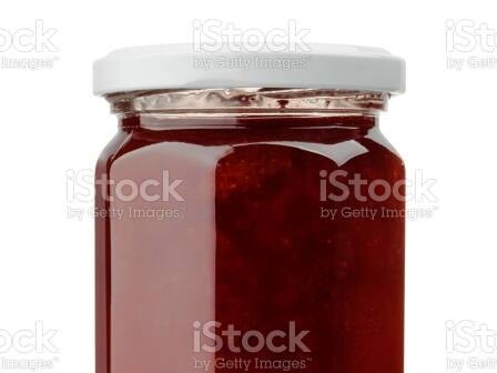
J is for Jam
K is for Knives

Textiles - tapestry
22 x 24cm
I like to have a slow stitching in front of the TV type of project on the go which is the main inspiration for this piece. I had a scrap of canvas and a bag of wool oddments which dictated the size and colours. I like the idea of this very traditional form being used to show a non-conventional image so sketched out the three knives. As I got towards the end I really liked the blank space left when it was nearly finished and so decided to leave it. I will come back to this idea of leaving blank canvas in future projects, perhaps planning it into the design.
L is for

M is for Men Put the Bins Out

Chalk pen on bin bag
90 x 75 cm
When I was looking for statistics on gender divisions in housework I came across a graph showing tasks done solely by men or women in UK households. The graph shows a clear division of labour and inspired this haiku. Felt fitting to put it on a binbag.
N is for Naughty But Nice

Manipulated and digital images
Digital image
The advertising phrase 'naughty but nice' seems to be something that sticks with me and applies to more than the cream cakes it was originally written for. It brings up the idea of treats (especially food) being something we should feel guilty about enjoying through the idea that they are 'naughty' which I think impacts many women's eating habits. I chose to represent this phrase by altering the text on this Roy Lichtenstein painting as it is a postcard I had on my bedroom wall as a teenager and beyond. I think the original statement points to difficult teenage relationships with both parents and food. I added a pop art style cream cake to work alongside the statement. This was the first thing I used procreate for and I think I would find it easier and quicker to make now.
O is for Oven Gloves

Textiles - stitched paper
36 x 15cm
I like experimenting with alternatives to fabric. Inspired by the beautiful paper sculptures made by Jennifer Collier the glove was made from old recipe book pages and hand stitched to give the impression of quilting. Photographed laying on a crumpled tea towel as this is what I would use instead of on actual oven glove. I considered ironing the tea towel but thought better of it.
P is for Pots and Pans

Mixed media. Paper, papier mache and tetrapac 3D models digitally imposed onto image of linocut print.
Digital image. Pots and pan diameters (not including handles) silver saucepan - 15cm , recipe book pot - 20cm, black frying pan - 12cm
The silver pan is made from sewn together juice cartons as I wanted to try using them to create something 3D. Although it worked it is not neat but I learnt some stuff along the way. The large pan is made from recipe book pages and the frying pan is papier mache formed around an actual mini frying pan. I photographed the pans and placed them onto a linocut of my oven (made a few years ago).
Q is for Quiche

R is for Recipe Books

Pen drawing with digitally added colour.
Digital image. Original drawing - 15 x 15cm
I like the flat colour achieved when adding colour digitally to a non digital drawing. I also enjoy the contrast in the two processes, I draw quickly but add colour slowly. The recipe books are from my own collection, I don't often follow recipes but I do love reading them for inspiration.
S is for Stove

Digitally manipulated image
Digital Image
Wordle is a recent hit and I thought it would be good Procreate practice to manipulate the letters to make my own kitchen related puzzle. I took screenshots of the puzzles as I completed them each day crossing off the letters I needed. It'll be annoying if 'stove' comes up as the answer and I could have just taken a screenshot.
T is for Triangle

Collage
60 x 30cm
Inspired by Martha Rosler's kitchen collages I tried to refer to the worries of climate change, war, refugees and rising prices going on outside the calm of the kitchen. This was created in layers, making the kitchen scene, the outside world and then the floor as three separate pieces and then putting them back together.
U is for Utensils

Typology - photographs of utensil shadows
Digital image
Noticing the crisp shadows of utensils on the worktop as I unloaded the dishwasher one morning led to this typology. The utensils are all clearly recognisable but made more interesting by being seen in a new way.
V is for Vegetables

Textiles - cyanotype on fabric with acrylic paint
26 x 21cm
Made on the day I was experimenting with cyanotype to make 'cutlery' I decided to try using vegetables too. I had been shopping in the morning and tried to buy one tiny bit of broccoli in the greengrocer shop, they let me have it for free! I used thin slices of carrot and mushroom. The carrot tops are actually strands of the herb fennel. I added colour with acrylic paint and thought about adding stitch, I started to add some lines to the carrots but decided they look better as they are.
W is for Washing Up
Video
1 minute 37 seconds
In response to the range of thoughts and emotions connected with the everyday object of my washing up bowl I had the idea to write on it with whiteboard pen and fill it with water (I don't know why it just seemed fun). I found the extremely apt accompanying music (The B52s - Housework) by searching for songs to do with cleaning and played it over Alexa as I filmed.
Please note the video here has no sound as the music infringes copyright so YouTube won't host it - fair enough. If you want to listen as well as watch go back to W in the main archive where it is hosted by Vimeo who don't mind.
X is for Xanthum Gum

Photograph
Digital image
There isn't much that starts with an 'X' so I did some research and came up with xanthan gum. I had no idea it was an ingredient you could actually buy in the supermarket. This is just a photograph, no manipulation, stitching or enhancements. It was almost a gap in the archive but is included to demonstrate that different weight is given to different objects. X wasn't deemed important enough for a 'proper' entry.
Y is for Yogurt

Z is for Zest
Animation
1 minute 39 seconds
Although nothing like his work in the end product I took my inspiration in part from the work of animator Cyriak. I wanted to make something bright, kaleidoscopic, a bit trippy and full of zest, both literally and metaphorically. It was my first use of Procreate to make an animation so I learnt a lot along the way.
Music from BenSound
Create Your Own Website With Webador